A few months ago, I was contacted to take on a UX job. Client have a night leisure platform with two level users: external users (outside traffic) and workers themselves (intranet) and, within them, three different areas or roles.
Platform was a 20 years old system full of bugs and patches. My mission was to rethink all the internal platform. Visual design was the easy part because client finally wanted a google material design style (after several meetings and decisions). Challenges were others:
- Hours and hours of meetings to make a good briefing: requirements and strategic goals
- Days of writing mechanicals proposals for each internal role and make the correspondant presentation to the client
- Define a cross structure for each section of each role and hierarchize them
- Implement interactions and define clear paths
- Internal testing and changes.
Here are some of the wireframes
-----
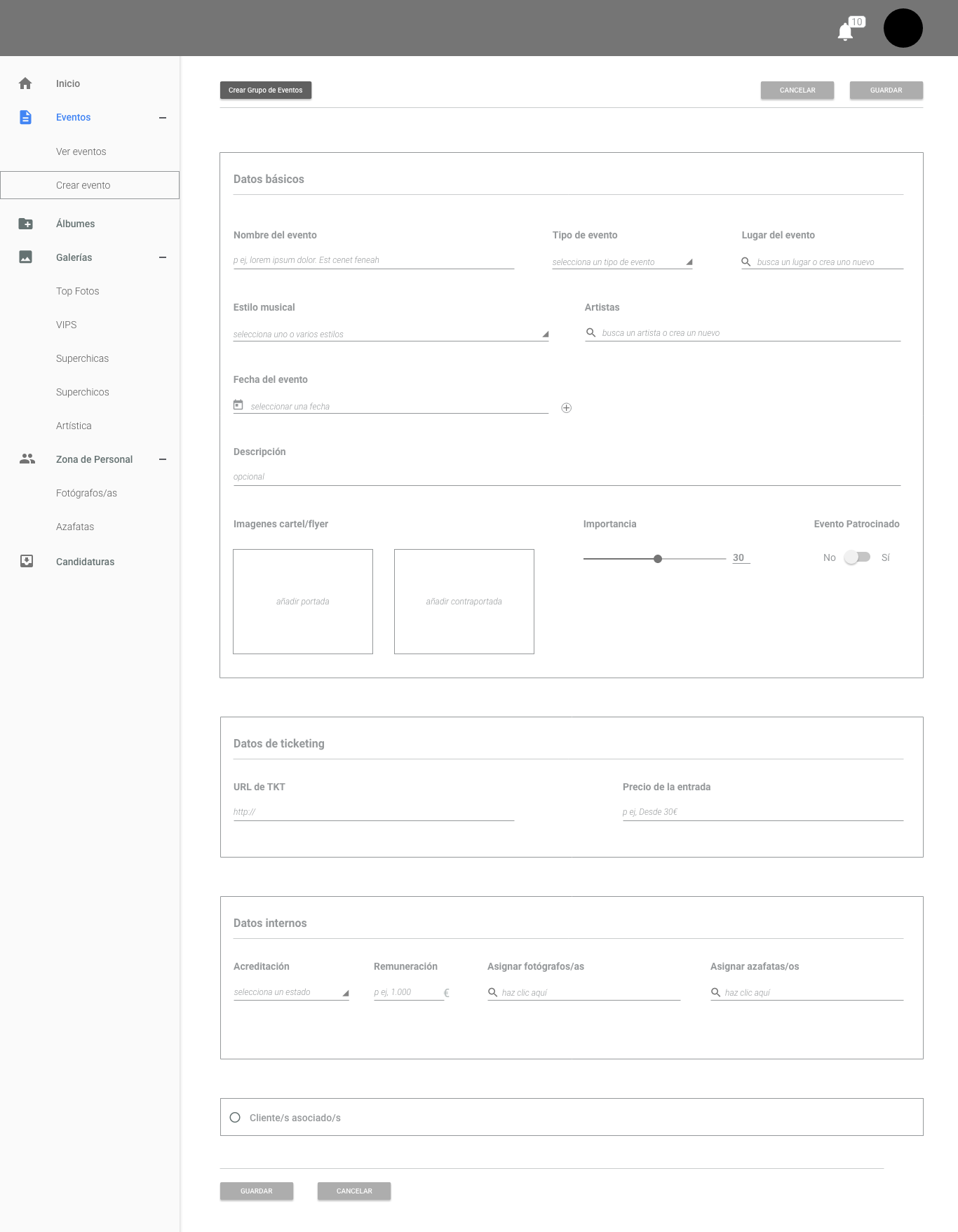
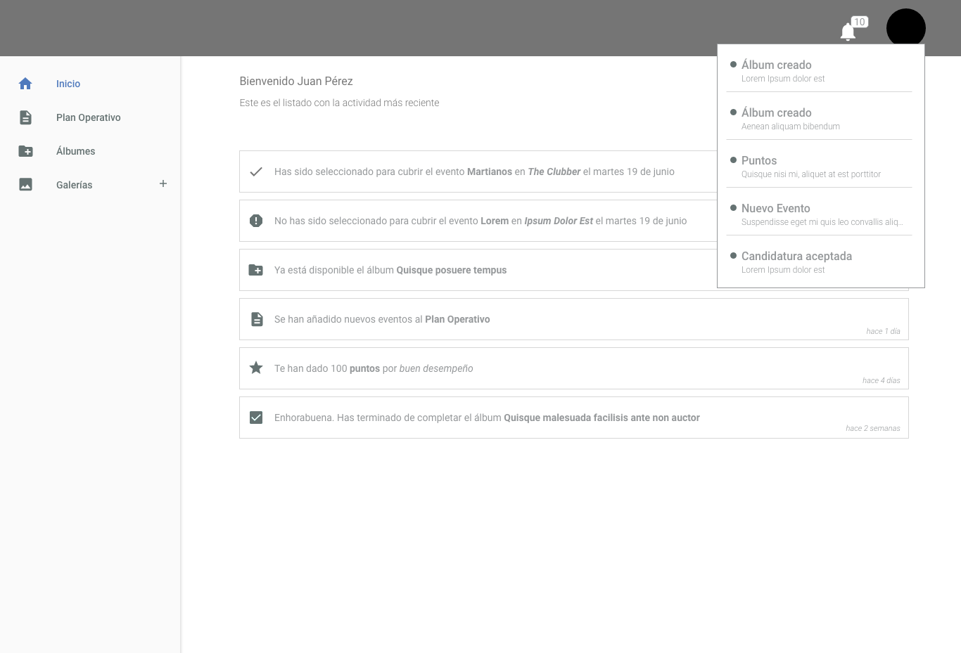
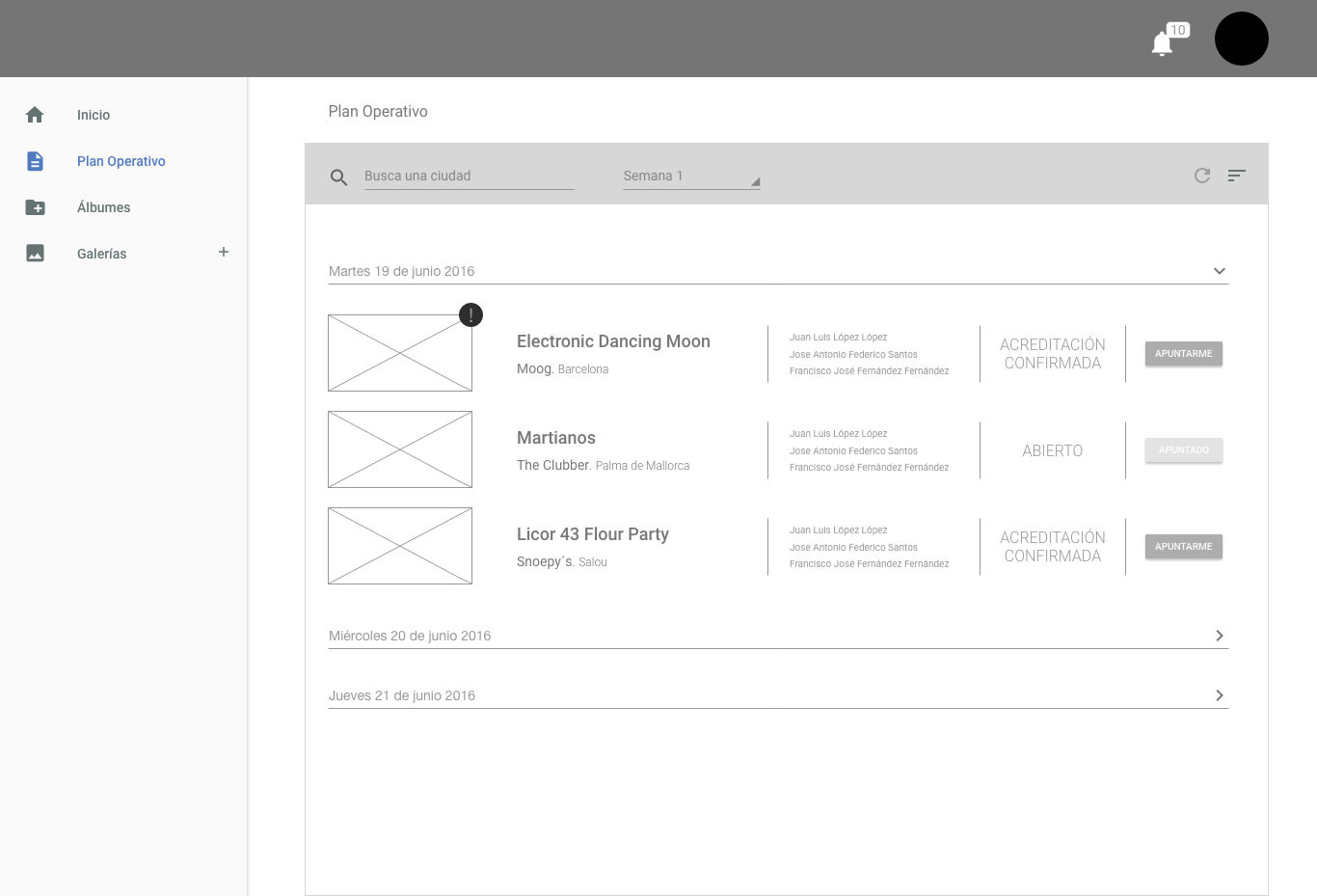
Home screen for Role 1. As I said before, challege was not prototype this, it was what this screen means for these users, the info they have to read first and what they are going to do after.
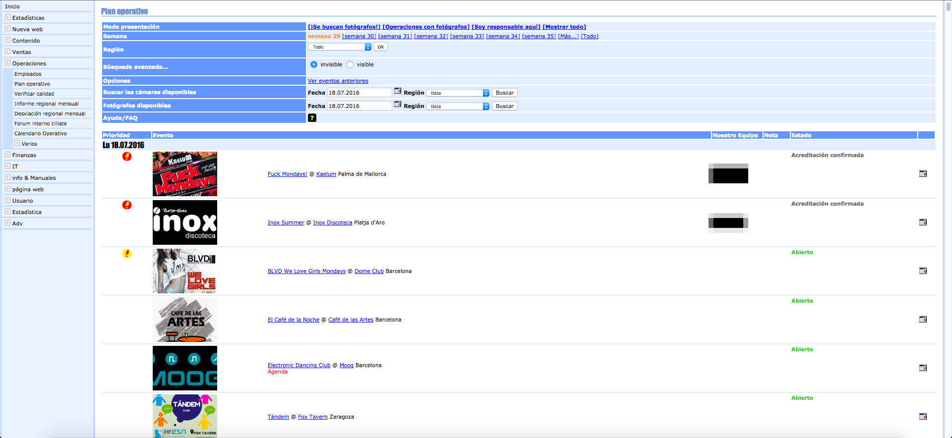
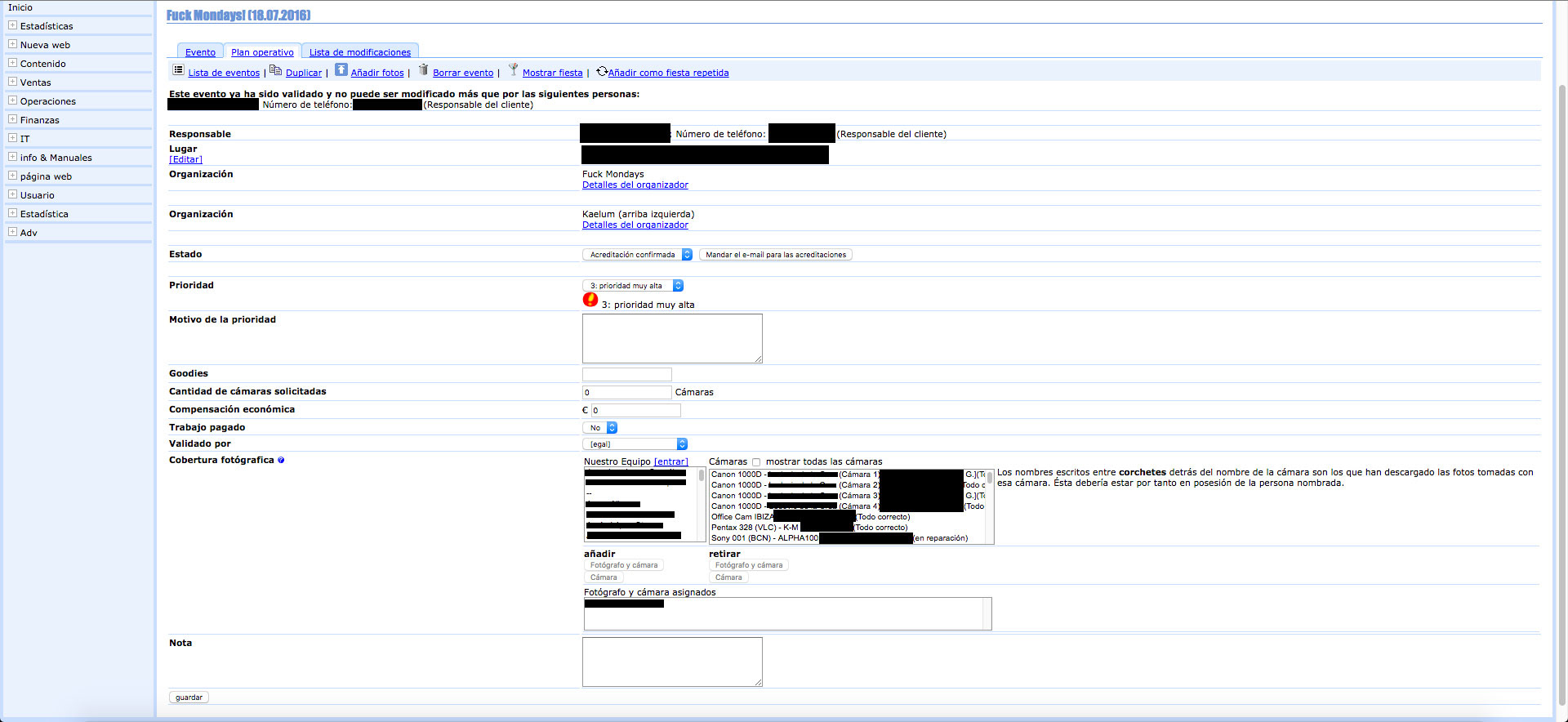
That´s how it looked before...
Rebuilding of the same screen...
Old subsection...
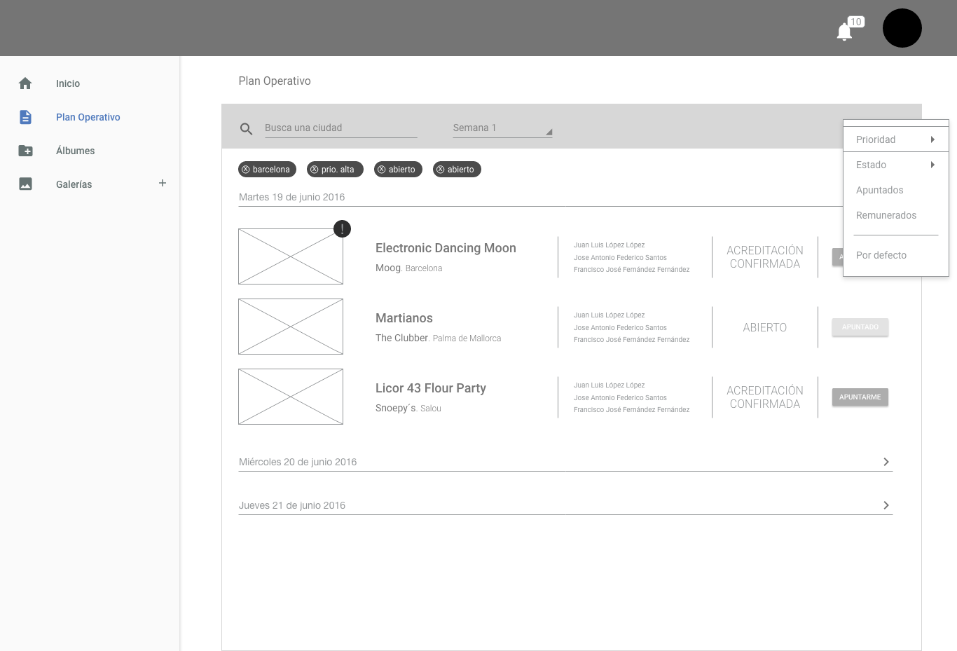
New interactions and content hierachy...

Brand new sections and content gathered in same view
Some views explained in video (just a visual example of how some screens works)
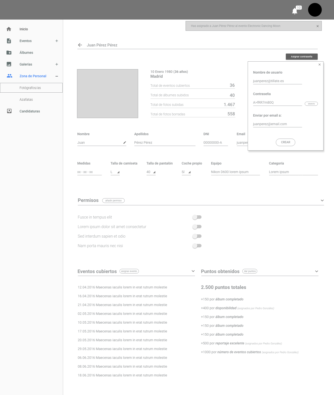
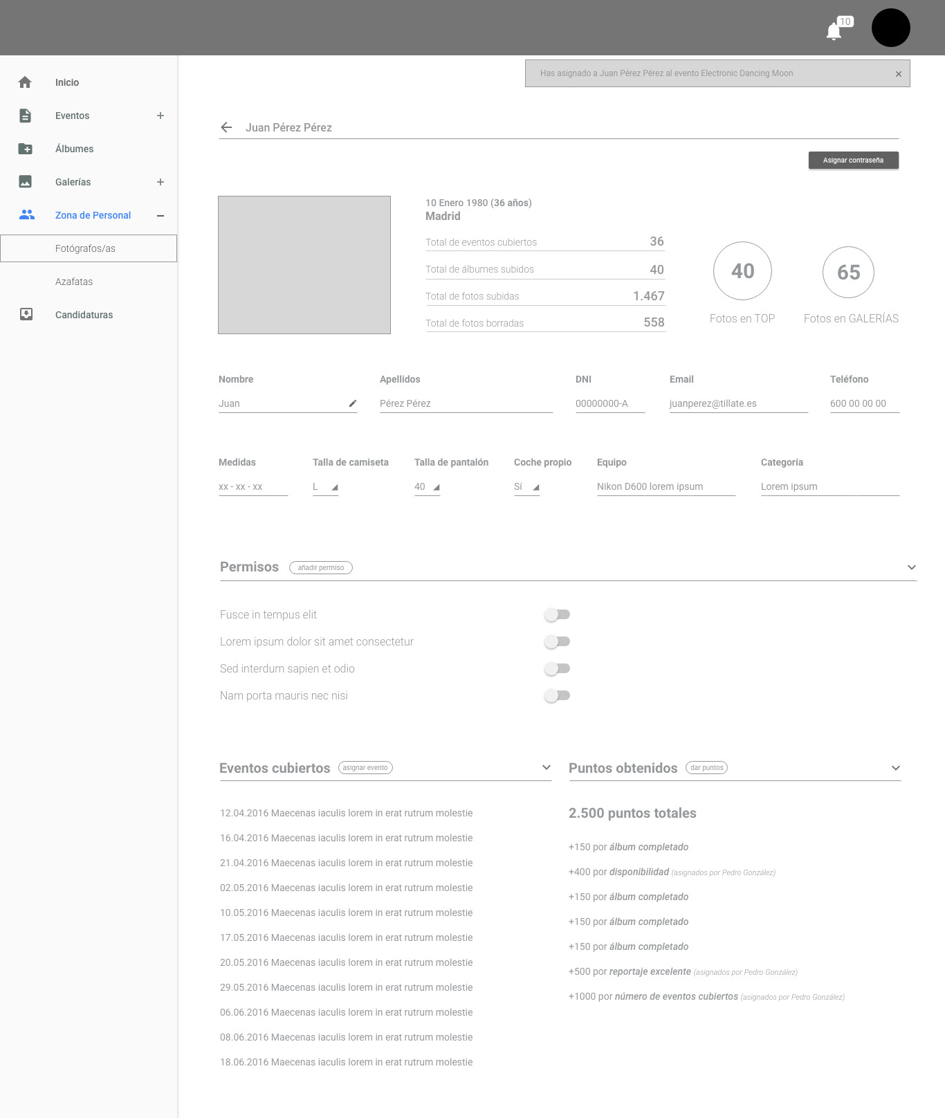
A single view that contains more than 20 different interactions which affects the rest of roles and areas. Before this, it was a real nightmare...
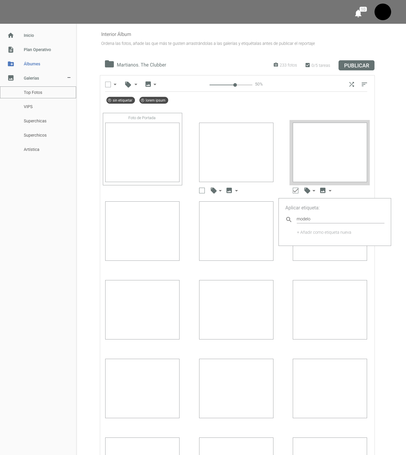
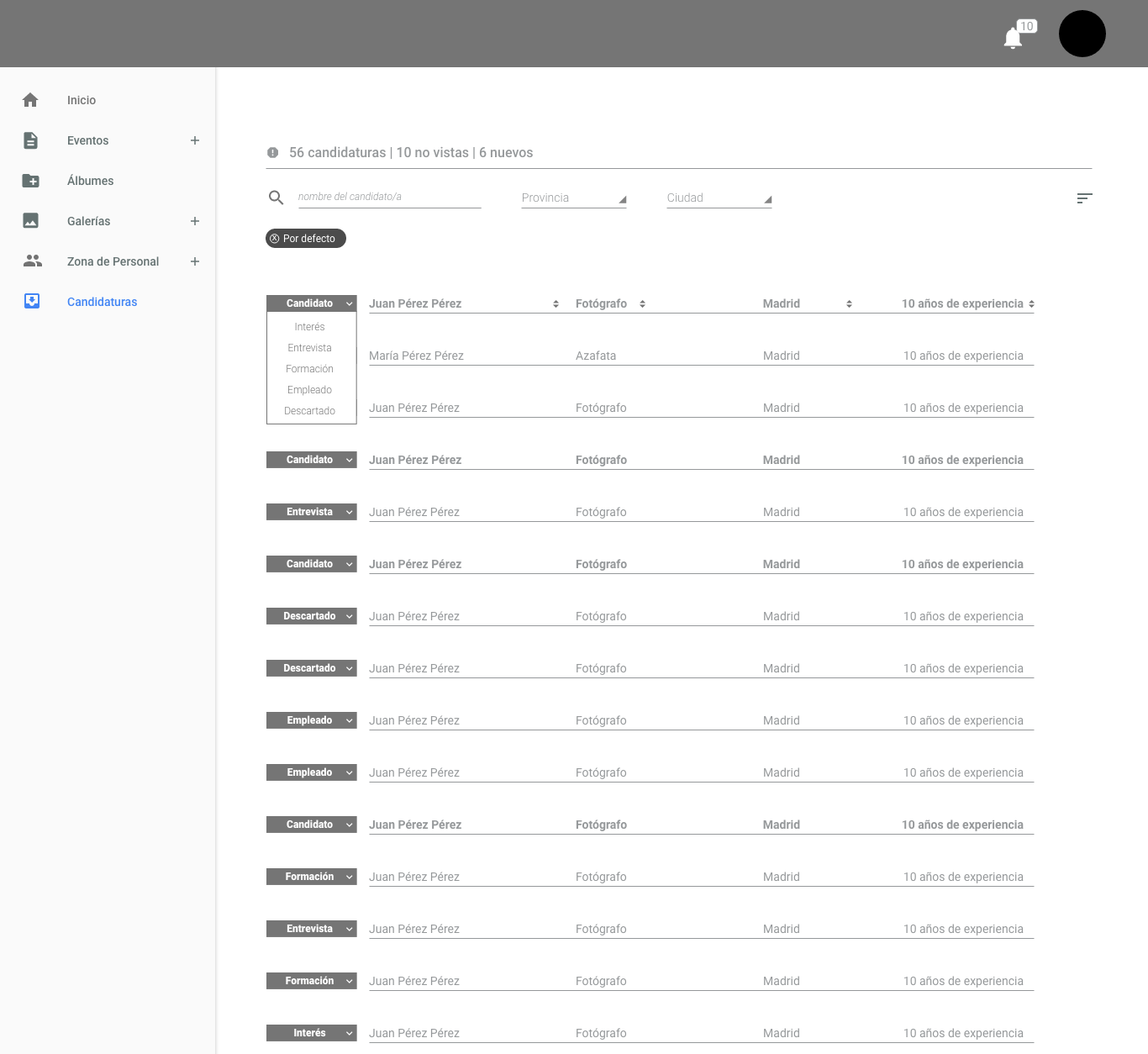
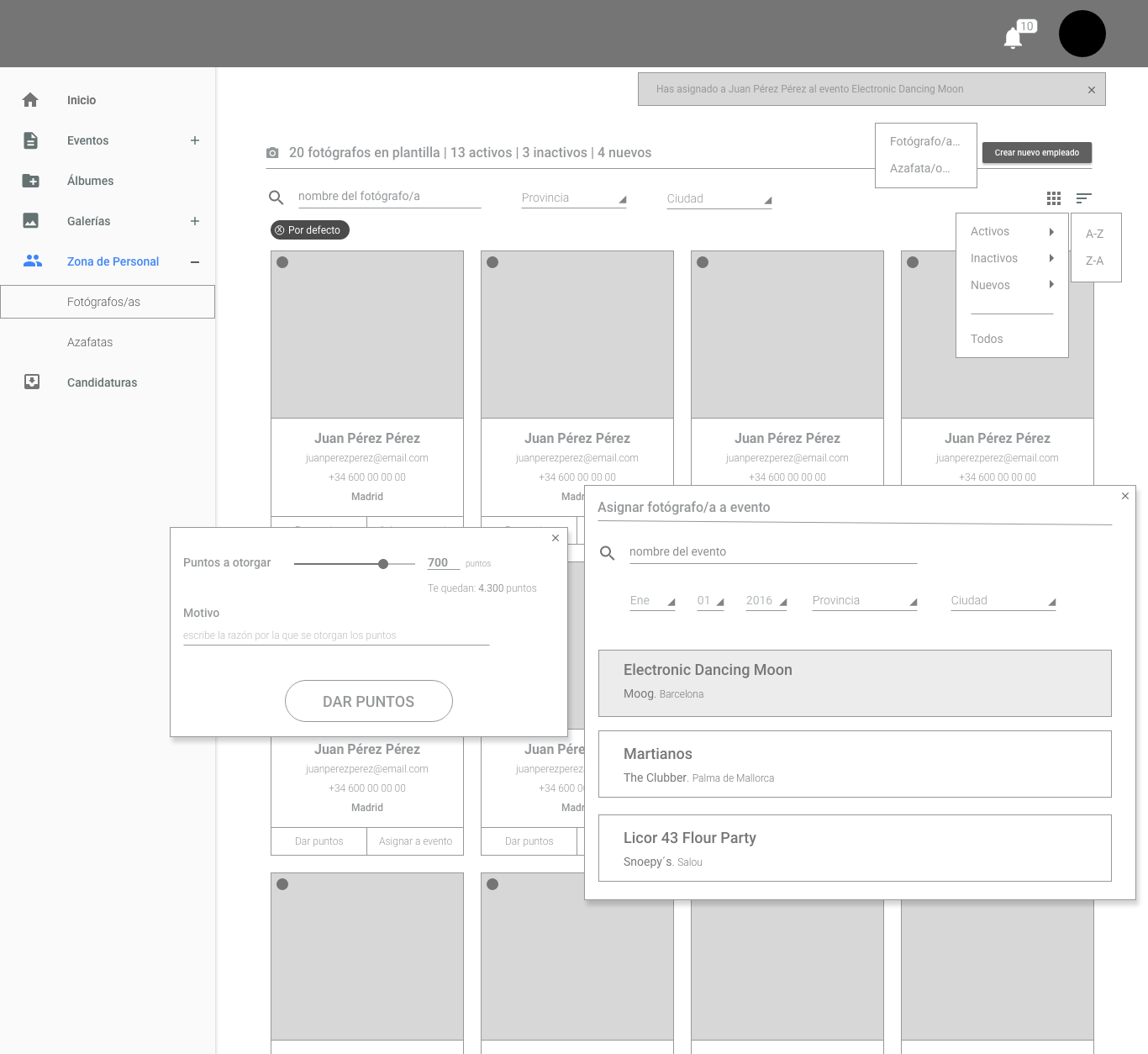
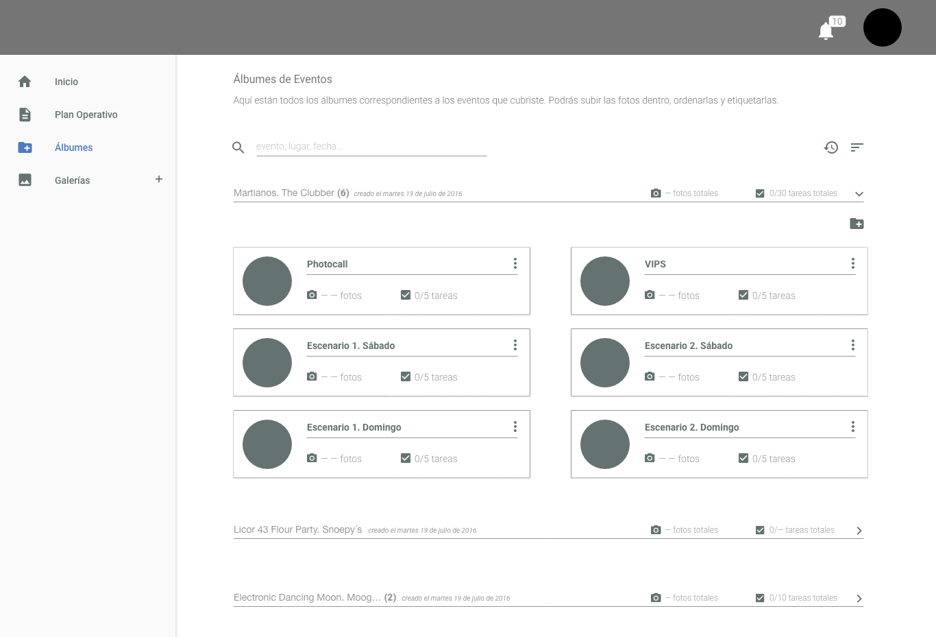
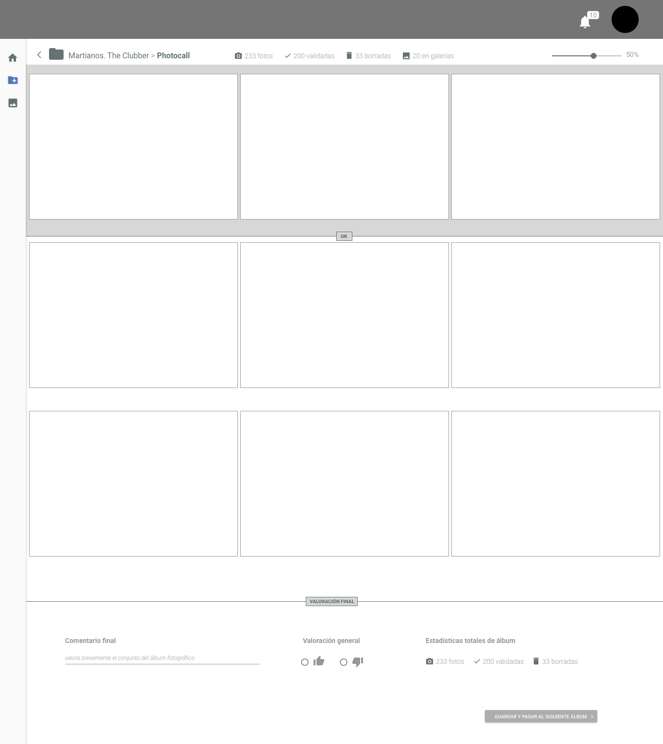
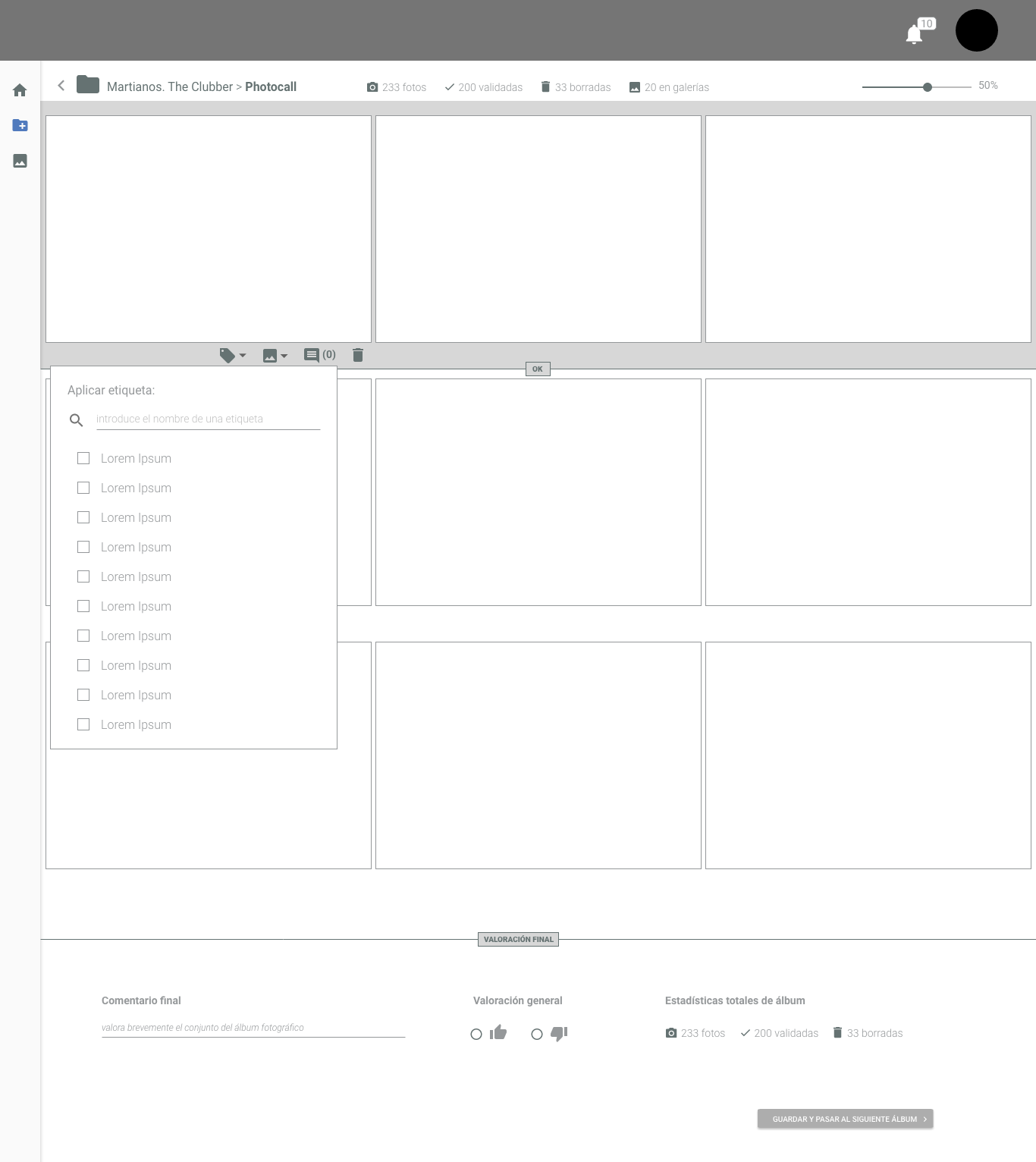
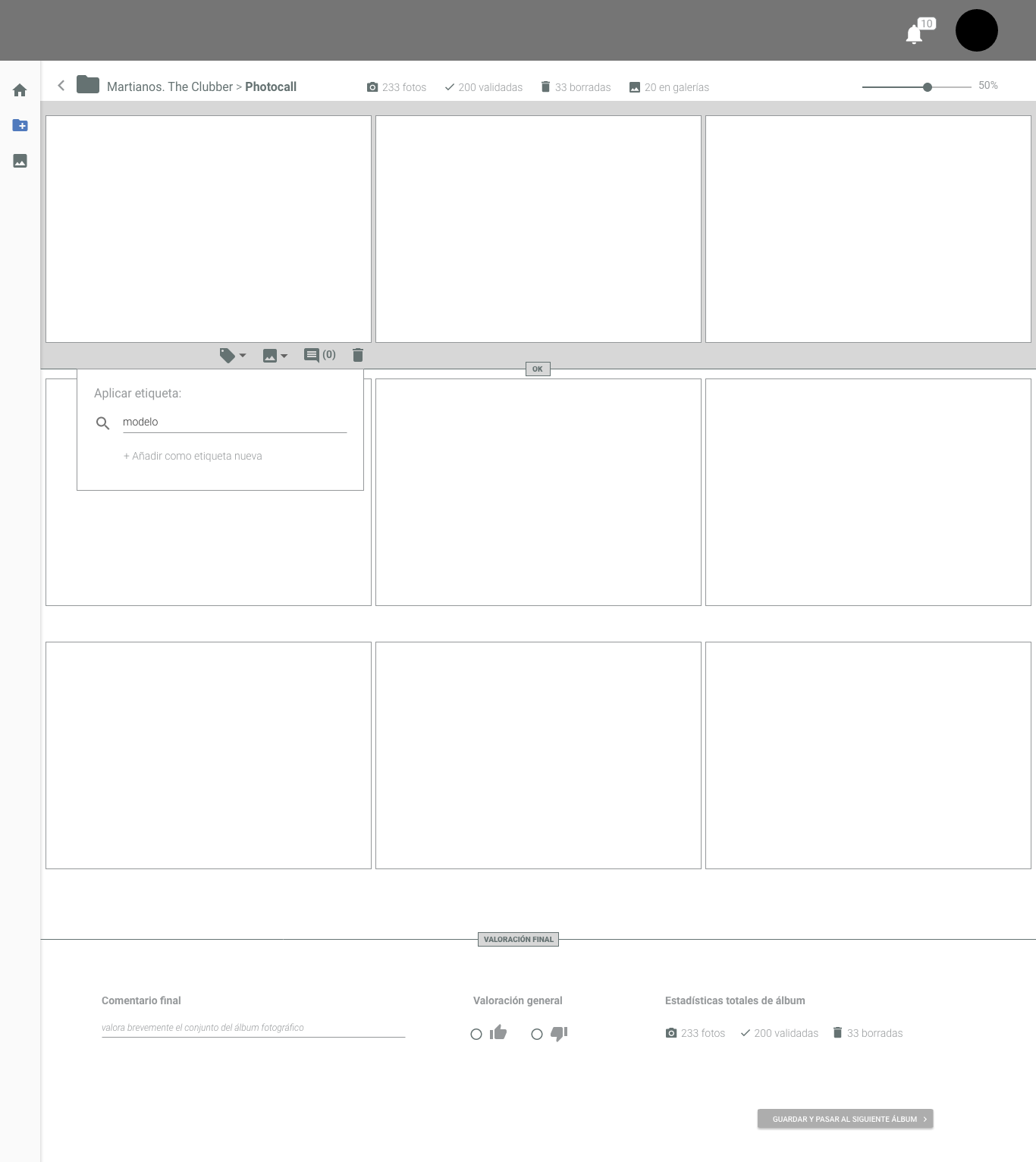
Some wirefrimes for Role 2. Before this, Role2 had to look at photos one by one and click to give ok. Now OK it is just scrolling photos. Role2 can tag, edit comments and rank photos in the same view.


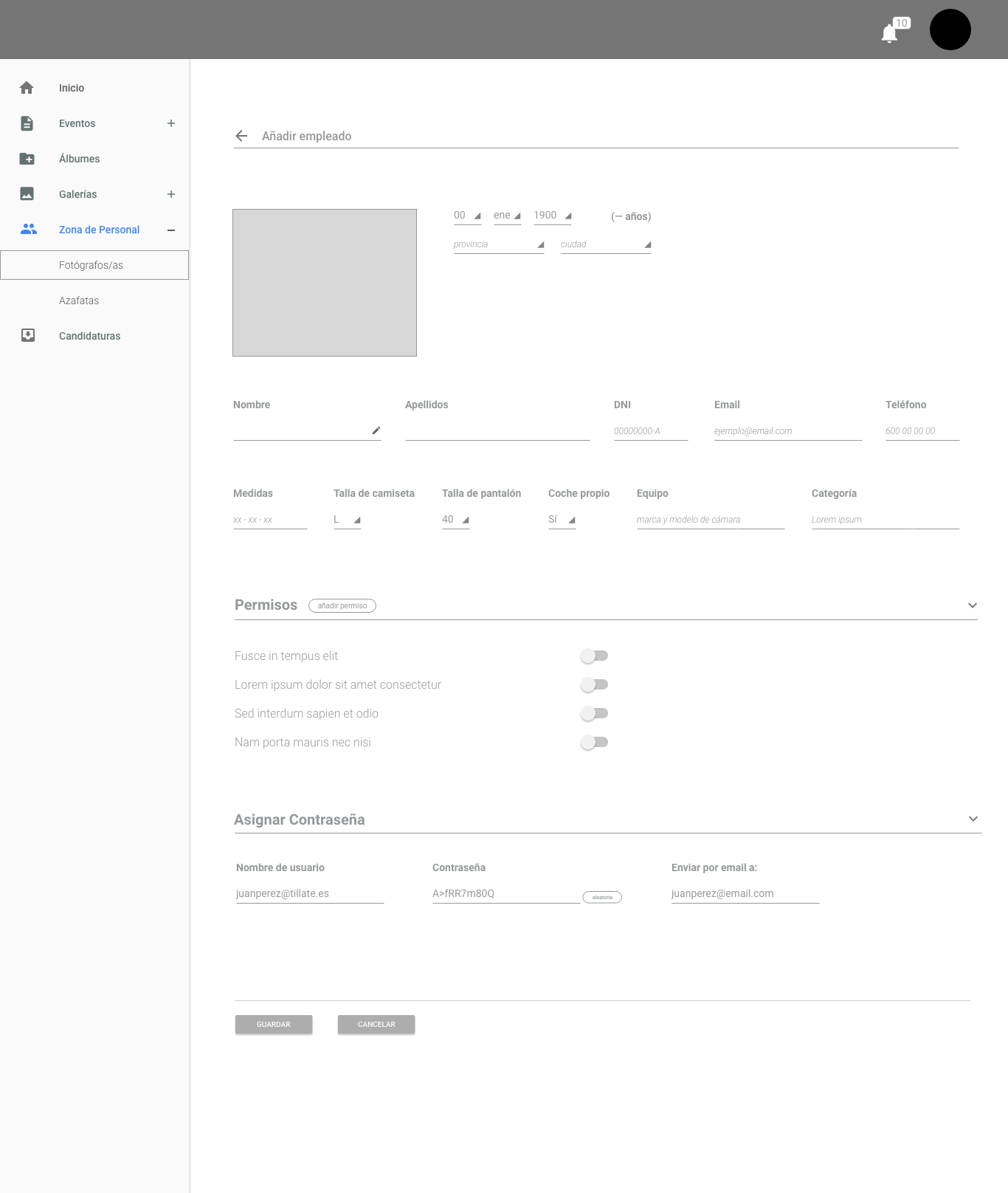
Some wireframes of Role 3. Designed from scratch after meeting key users.